As the seasons change and the air turns crisp, it’s only natural to think about ways to settle in and cozy up for the holidays and for the approaching winter. Paint and home decor companies know that autumn signals a renewed interest in “nesting” for most homeowners. The introduction of color palettes and design trends for the coming year is timed to whet public appetite for making changes to the home environment. That’s not all bad! Fall is a great time to add some zip to the home scene.
How to Use Pale Trending Colors of the Year in your Home
Image via: Benjamin Moore
This year, however, the unveiling of 2016 colors was a bit of a surprise.
Instead of leading us all in the direction of bright and bold, two of the major names in the world of decor trends point to the soothing qualities of whites and pale tones. Benjamin Moore Paints even named “Simply White” the 2016 Color of the Year, noting that it’s time “to surrender to the complexity of white.”
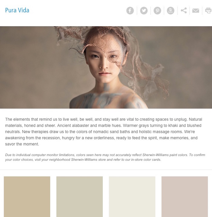
In the same nod to neutrals, Sherwin Williams introduced Pura Vida as one of four separate color palettes for the coming year. It features subtle hues drawn from nature and it features pale tones rather than the vibrancy of the previous year. Paint names reflect the mood: Alabaster, Ancient Ground, Useful Gray, Doeskin. They aren’t quite “no color,” but they are far from bright.
Image via: Sherwin Williams
Where Does It Lead?
Were does this forecast lead in terms of decorating your own home? Well, unless you insist on starting from scratch to reflect the latest “with-it” trends, it means that you have freedom to mix some new with your existing decor, and to keep it simple. It also allows you to build a base that you can brighten up when the mood strikes you.
If your walls need freshening, choose a “whiter shade of pale” to serve as a starting point. Benjamin Moore notes that, of its top 10 best-selling colors, five are shades of white. With more than 250 variants of white to choose from, you will certainly find one to love.
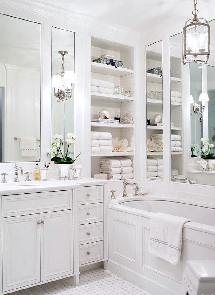
White can be the “bones” of a soothing, Zen-like ambience for any room of your home, but it’s particularly appropriate for establishing a spa-like feel in a master bathroom. Think white in all its forms: sculptural bathroom fixtures, soft terrycloth robes and towels, white linen shades at the windows, white or bleached wood cabinets, white marble underfoot. Add in pale vanilla candles for visual and “scentual” appeal and luxuriate in your own private retreat to restore a sense of balance to your life.
Image via: Home Bunch
Throughout the Home
Revamping a bathroom is a perfect way to begin a home update. Unless it’s time for a major rehaul, the smallish size of most baths means that a redo can be accomplished in minimal time and within a reasonable budget. If you already have white bathroom fixtures, layer on different textures and varying shades for a stylish monochromatic scheme. Use the same principles for decorating a dynamite kids’ space, but add in some gray or beige towels that won’t broadcast the residue of clean-up efforts. Use natural toned wicker baskets to corral grooming gear.
Go subdued in a guest powder room. Refinish a vanity cabinet and framed mirror with chalky milk paint, add a fluffy white rug, stack armloads of pale hand towels on a counter, and accessorize with pale seashells. Find sepia-toned prints of deserted beach scenes and have them framed in rustic gray wood. Avoid a laboratory or clinical feeling by adding plenty of texture and making certain that the “whites” don’t all match. It will always be beautiful, and never boring.
When you’re ready, go ahead and expand the non-color into other areas of your home.
For more color ideas on Stagetecture, click here.
Receive Stagetecture's Daily Lifestyle Ideas
FREE - Daily emails with recipes, home decor, D.I.Y, and lifestyle tips! : ) Who doesn't need help?


Great post and tips, Ronique! Long gone is the “clinical white” mentality. White is fresh, clean, and versatile. 🙂