
Entry #3213, January 24, 2014
Today we continue Stagetecture’s feature ‘Olioboard Inspiration‘. Before you were inspired by – ‘Creative Kids’ Room Organization Ideas‘ from Tonya Wright. Today, I feature Kimberly Latimer who is a member of the the Facebook Olioboard Fan Room group and she has a gorgeous way of helping you choose inspiring winter colors for your interiors. See her tips for finding the right winter colors that inspire your personality!
To see all the past Stagetecture’s Olioboard Inspiration members on Pinterest click here.
Olioboard Inspiration #64
‘Choosing Inspiring Winter Colors for your Interiors – Kimberly Latimer
Where I live, winter color is scarce – shades of gray, brown, dried gold and muted reds comprise a monochrome color palette relieved only by snow, and an occasional glimpse of blue sky. So where do you look for inspiration to spin the color of winter straw into design gold for living or bedrooms? Adjust your color lens and take a closer look outside! Bringing the outdoors into your winter design inspiration just takes some extra imagination, and a little color know-how.
Winter color is all about monochromes. In the strictest terms, monochromatic color is based on a single base color that is diluted by adding black and white to create an extended range of grayed shades, tones and tints from dark to light. It is gray that sets monochromatic color apart from other seasonal hues making them easy on the eye, ode to their lack of contrast. But like winter color, a monochromatic color scheme can emphasize limitations. “Chalk” colors take that soothing color palette up a notch. By adding more variety in shades of color and replacing a bit of that missing contrast, chalk tones add interest to a wintery color mix. Annie Sloan’s Chalk Paints are amongst the best known chalk colors:
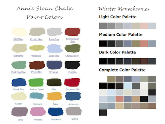
Olioboard Inspiration: Choosing Inspiring Winter Colors
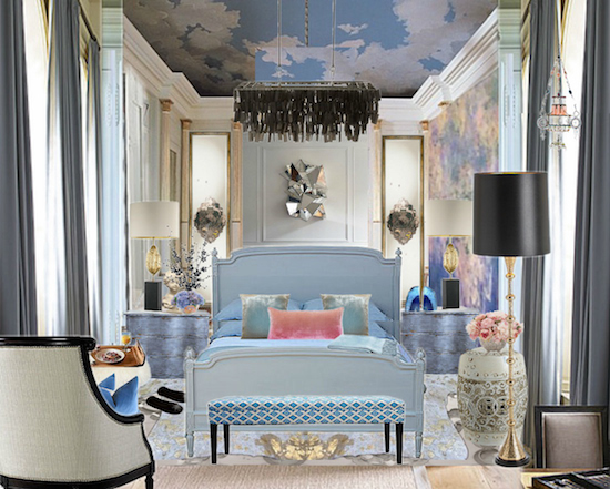
Olioboard and a chalk-inspired color palette derived from the colors inspired by my frozen back yard transform this bedroom design, which lacks for nothing in warmth, color or interest!
5 Tips that make color work:
- Murals are budget-friendly art – Arguably, impressionist painter Claude Monet best illuminated the value of chalky color in his later paintings. I have included a wall mural of his famous water lilies in a bow to his color mastery.
- Use Feel-Good Color – That welcome relief I mentioned from the occasional blue winter sky dominates my bedroom’s color palette. Using a range of blues optimizes a monochromatic approach to my winter color mix.
- Ceilings love color, too – Ceilings are frequently ignored color opportunities. Treating the ceiling as an extension of my winter palette reinforces the overall muted color scheme.
- Vary shades to create depth – Peppering the design with black and charcoal gray adds just enough visual weight to create depth and interest.
- Add sparkle to Color – Mirrors, metallic surfaces are the jewelry of your design – lighting shows off those sparkling finishes.
The real magic of this winter palette is that chalky grayed color scheme, and its seamless ability to transform into spring, summer or fall color. Switching up the bedding, pillows, throws and lamp shades to create the next season’s mix will take this winter inspired chalk palette easily through all four seasons of color!
About Kimberly Latimer:
My background is in fine arts with an emphasis on oil painting and Tromp Loi’el . I have been a student of color for almost three decades, and I still find it has more to teach me. I have designed both product and packaging for Disney’s Animal Kingdom and Natural History Museums in the US and Canada, but my passion is for Interior and Lighting Design. My style tends to be colorful and eclectic, favoring the best of all worlds with a hint of the artistic and unexpected!
For more Olioboard ideas on Stagetecture, click here.
Receive Stagetecture's Daily Lifestyle Ideas
FREE - Daily emails with recipes, home decor, D.I.Y, and lifestyle tips! : ) Who doesn't need help?


Leave a Reply